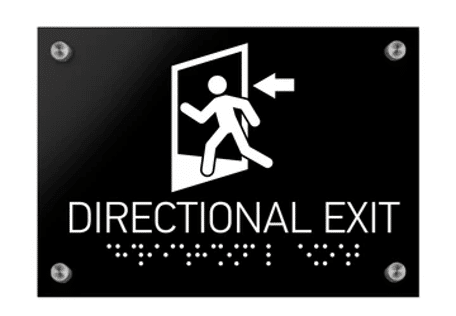
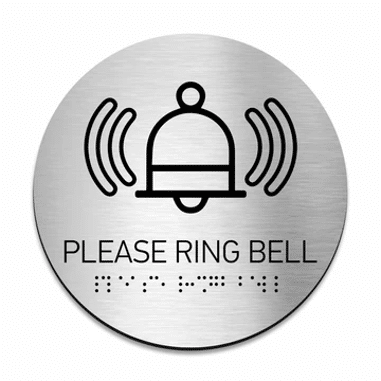
When it comes to creating the perfect ADA directory sign, it is not just about ticking off boxes on a compliance checklist — though, yes, that is definitely important. A good ADA directory sign combines functionality with a bit of flair, ensuring that everyone, regardless of ability, can navigate your space with ease and maybe even a smile.
Compliance with the ADA Standards
First and foremost, a good ADA directory sign must comply with the ADA Standards for Accessible Design. These standards are not difficult to follow but you have to be attentive to detail or choose only those manufacturers that already have ADA-compliant signs in their stock.
Compliance with ADA means it needs to have the right font size, Braille translations, and high contrast between text and background. Think of it as the equivalent of wearing both a seatbelt and a stylish pair of sunglasses: safe, yet still looking sharp. These signs are designed to be legible and accessible to everyone — so no one ends up wandering around like they are in a maze of confusing hallways.

The Well-Thought-Out Design Choice
Now, let us talk about style. You must keep in mind that your building might be different from all the others. We know that every office, hotel, restaurant, store, or shopping mall has its own vibe, and your signs should match that. That is why you should explore a wide range of ready-made designs that cater to every taste. Whether you are running a sleek modern office or a cozy, rustic workspace, we have got something that will fit right in.
- Modern: Clean lines, minimalist design — perfect for the office that is all about that “less is more” lifestyle.
- Wave: A little bit of movement, a little bit of flair. These signs add a dynamic touch without going overboard.
- Sherwood: If your office has a touch of the outdoors, Sherwood signs bring in that natural, earthy feel. Think of them as the Robin Hood of ADA signage — stylish and bold.
- Classic: Timeless and elegant, just like that leather chair in the corner of your boss’s office. These signs never go out of style.
- Genova: These signs are all about sophistication. If your facility is more “champagne and caviar” than “coffee and donuts,” Genova is your go-to.
- Authentic: For the space that prides itself on being genuine and original. These signs are as real as it gets.

And those are just a few of our designs — there is plenty more where they came from!
A Touch of Uniqueness
But who says compliance can not be cool? While adhering to ADA standards is non-negotiable, that does not mean your sign has to be boring. Adding a touch of uniqueness to your ADA directory sign can make it stand out in the best way possible. Whether it is a pop of color that complements your brand or a sleek design that makes people take notice, a little creativity goes a long way. After all, even your signage deserves to have a bit of personality — just like your space.

