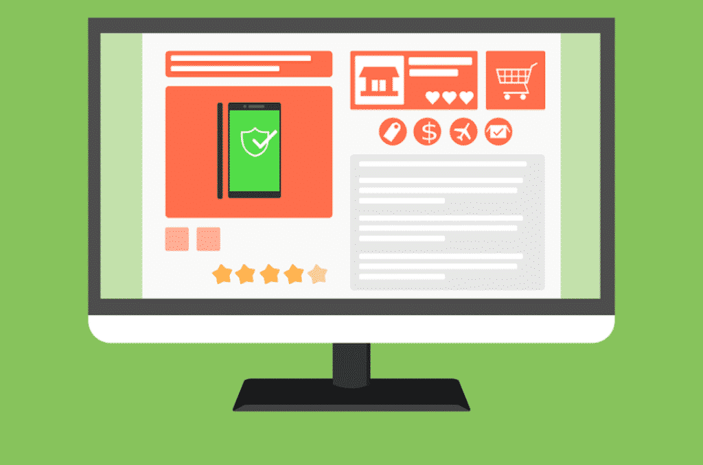
A beautiful website design plays a significant role in converting your website visitor to potential customers. The design components and other calls to action buttons of your website should make the purchase method quick, easy, and incredible.
Perhaps you’re skilled enough to advertise your products online, but if you don’t make the store user-friendly, you may lose potential customers. Also, you could lose the money that you have spent for marketing purposes. So today, we are going to provide the best design tips for the e-commerce website.
1. Create a Simple Design
Many people think that a gorgeous web design will catch the eye of the visitor. But it is not valid. Users want a moderate website where they will get the desired product without any hassle. That’s why a simple website design helps to increase the conversion rate.
If you make an online store that is visually complex, visitors will lose interest in purchasing something from there. Avoid placing any unnecessary information and use a simple theme with sufficient whitespace.
Further, If you need assistance to create a web architecture platform to get started, you can consider Shopify, WordPress, or WooCommerce. This is how you will be able to make a professional and smart e-commerce website.
2. Use Add to Cart Button
Almost all the e-commerce websites feature a shopping cart button at the landing page’s right top corner. If any user selects an item, he can view it on the shopping cart. So it is a crucial button that you should consider.
Make sure this button remains visible and works appropriately. Because if any customer can’t utilize this button, you will not sell your product. Ensure the icon looks like a shopping cart. As you shouldn’t confuse people at the time of purchase.
Since this button is perhaps the main and essential part of your whole website, we suggest making it outstanding by using a bright color. You need to adjust the color with the background. Moreover, keep the button a bit larger so that people can find it easily.
3. High-Quality Photos
The greatest trouble in online shopping is that customers can’t see the real product before buying that. To solve this problem, you need to use high-quality photos on your e-commerce website. Also, try to add product videos to increase the conversion rate.
High-resolution photos are a must on e-commerce websites. Any obscure or fuzzy picture disappoints the customers. Please include a photo gallery of every product and let them see it from different angles.
A trendy highlight is a pop-up box where individuals can zoom in and view the product. This allows customers to see a particular product more closely. As a result, they can inspect the product thoroughly before making the purchase decision.
4. Appropriate Pricing
When you will start pricing your website, make sure to offer the right price for each product. Always be fair about the pricing of the different products, like CBD products you are selling. Provide the necessary details to make the purchase easy for your customers. You shouldn’t make your customers feel that you are charging extra money from them.
This thing is also recommended at the time of shipping. Always define the shipping cost concisely. Also, let the customer clear about the shipping policy and how much time it will take to reach the product.
Conclusion
So these are the main design tips that you should consider while creating an e-commerce website. Remember, only marketing is not sufficient. You must give equal emphasis to developing your online store. Thus you can generate more sales and earn a considerable profit.

